


The Psychology of Web Design: How to Persuade Your Visitors
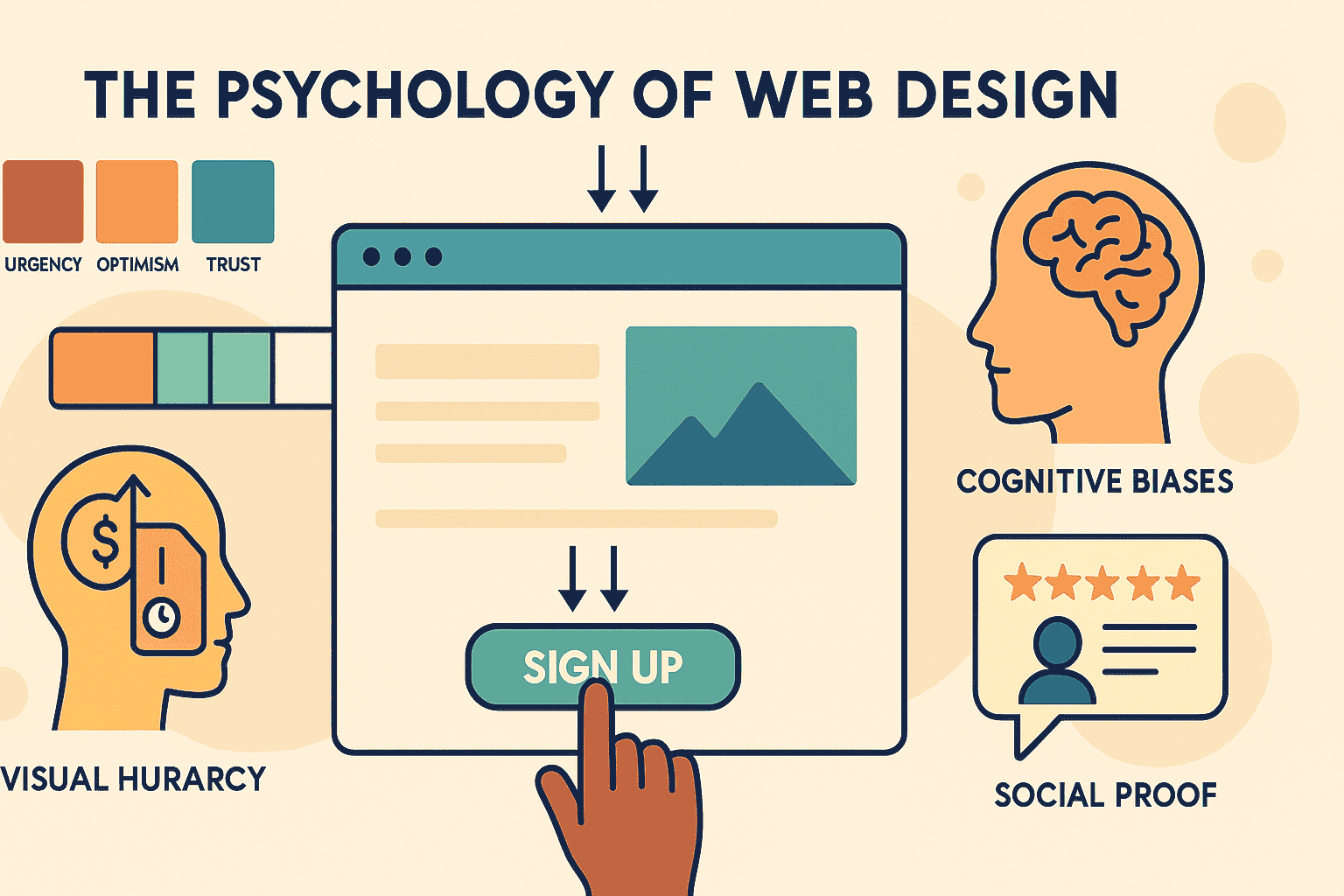
Introduction
Web design is about more than just making a site look pretty – it’s about influencing how visitors feel and behave. The moment someone lands on your website, they form an opinion almost instantly (within about 0.05 seconds!). In that split second, factors like your layout, colors, and overall visual clarity determine whether they stay or hit the back button. Studies even show that 46% of users assess a site’s design quality to decide if the site is trustworthy. In other words, a polished, user-friendly design isn’t just nice to have – it directly impacts credibility and conversions.
This article will explore key psychological principles in web design that can subtly persuade your visitors. We’ll cover how color choices set the mood, how layout and visual hierarchy guide the eye, how to tap into cognitive biases (like our fear of missing out), and how social proof builds trust. Along the way, we’ll include practical examples for different types of websites – whether you’re designing an e-commerce store, a blog, a landing page, or a portfolio. By understanding the psychology behind user decisions, you can craft a website that not only looks good but also motivates visitors to take action.
Color Psychology: Setting the Mood and Influencing Action
Colors aren’t just decorations; they evoke emotions and can influence visitor behavior on a subconscious level. In fact, color alone can improve brand recognition by up to 80% and directly affect trust and engagement. The colors you choose for your website’s palette should align with the feelings you want to inspire in your audience and the actions you want them to take. Here are some common colors and their psychological effects:
- Blue – Conveys trust, calm, and professionalism. It’s no surprise many banks and corporate sites use blue to signal reliability (think of PayPal or LinkedIn). If you have a finance, healthcare, or B2B website, blue can help visitors feel secure.
- Red – Grabs attention and creates a sense of urgency or excitement. It’s a color that can literally raise heart rates, so use it to spur action. E-commerce sites often use red for “Sale” labels or Buy Now buttons to nudge quick decisions.
- Yellow – Suggests optimism, warmth, and energy. Yellow can give a friendly, cheerful impression (used in moderation so it’s not overwhelming). It might suit a creative portfolio or a personal blog to inject some personality and positivity.
- Green – Associated with growth, health, and nature. Common on eco-friendly or wellness sites, green can signal balance and harmony. It’s also the go-to for “success” messages (like a checkmark for a completed form) because it indicates things are good to go.
- Black – Implies luxury, sophistication, or authority. High-end brands or design studios might use black for a sleek, elegant vibe. It can add drama and focus, especially paired with plenty of white space.
When applying color theory to your site, context matters. A bold color that works for a creative agency might not suit a law firm’s website. Always consider your brand’s message and your target audience’s expectations. Also, use color strategically: for example, make your primary call-to-action (CTA) buttons a contrasting color that stands out from the background. A brightly colored or contrasting CTA draws the eye and invites clicks. If everything on the page is the same hue, nothing stands out – so be sure to create contrast for important elements. An online store, for instance, might use a neutral color scheme but have an “Add to Cart” button in a vibrant accent color to make it unmissable. On a landing page, a contrasting signup button against a muted background can significantly boost conversion rates by immediately drawing attention. In short, choose colors that resonate with the emotion you want to convey, keep the palette consistent with your brand, and highlight key actions with deliberate color contrasts.
Visual Hierarchy: Guiding the User’s Eye
Visual hierarchy is the arrangement of elements on a page so that the viewer’s eye is drawn to them in a specific order of importance. In essence, it’s about what you notice first, second, and third when you look at a webpage. Human eyes don’t absorb a page all at once – we’re naturally drawn to larger, bolder, or more visually prominent elements first. A well-thought-out visual hierarchy makes sure that the most critical information (like your headline, key imagery, or CTA) grabs attention immediately, while secondary information is noticed later.
One way designers achieve this is by leveraging typical reading/scanning patterns. Research shows there are two primary patterns people use to scan webpages: the F-pattern and the Z-pattern. The F-pattern is common on text-heavy pages (like articles or blog posts) – people tend to scan across the top of the page (the first horizontal stroke of the "F"), then move down slightly and across again (the second horizontal bar of the "F"), and then vertically down the left side. This means that on a blog, for example, users will likely see the headline, maybe skim subheadings or the starts of paragraphs, and pay a lot of attention to the left side of the content. Knowing this, you might put an important takeaway or a table of contents in a sidebar on the left, or use strong subheadings and bullet points (since readers will catch those as they scan).
The Z-pattern is more typical for pages with less text and more free space – like landing pages or homepages. The eye moves in a Z-shaped path: left to right across the top (seeing the header or main banner), then diagonally down to the left side (often where a diagonal visual cue or an arrow might point), and then left to right again along the bottom. A classic use of the Z-pattern would be a simple landing page that has a logo on the top left, a catchy tagline or image across the top, then the eye diagonally goes to a prominent image or message in the middle, and finally ends on the bottom right where a signup form or button might be. This guides the visitor through a story: first who/what, then some supporting info or visual, and then the call to action.
Beyond these patterns, you create visual hierarchy through size, placement, and contrast. Make your key headlines larger and bolder than body text. Position crucial elements in places of prominence – for instance, a featured product image or value proposition could be front-and-center. Use color and contrast to your advantage: a solitary bright button amid a neutral layout acts like a beacon (taking advantage of the Von Restorff effect, where an element that breaks from the rest is more memorable and eye-catching). Likewise, whitespace (or empty space) around an element can focus attention on it by isolating it. For example, a portfolio website might showcase a highlight project on the homepage with a big, high-quality photo surrounded by lots of white space and a bold title – this minimalism ensures that that project is the first thing visitors focus on. In an online store’s product page, the product image and name might be big and at the top, with descriptive details below in smaller text, guiding shoppers to look at the product visuals first (since images often sell the product) and details second.
In short, visual hierarchy is your silent director’s cue to users: it tells their eyes where to go. By planning your pages so that important content stands out through size, color, and placement, you lead visitors through a narrative – from the headline that hooks them, to the supporting info that persuades them, and finally to the button that converts them.
Layout and Simplicity: The Power of a Clean Design
Layout goes hand in hand with visual hierarchy, but it focuses on the overall structure and organization of your pages. A clean, intuitive layout ensures that visitors can navigate your site effortlessly – which is critical, because if users have to think too hard about how to find information or what step to take next, they’ll likely give up. In web design, simplicity truly is powerful. Presenting too much information or too many choices at once can overwhelm users and lead to decision paralysis (a phenomenon related to the “paradox of choice,” where people faced with too many options end up choosing nothing at all). On the flip side, a streamlined layout with a clear focus helps reduce cognitive load. Hick’s Law, a principle in psychology, backs this up: it essentially says the more options you present someone, the longer they take to decide. For a website, that means to improve user decisions (like clicking a button or finding a product), fewer distractions and clear choices are preferable.
Consider your navigation menu and page structure. A best practice is to keep your main navigation options limited (perhaps 5-7 top-level menu items at most). This way, a visitor isn’t bogged down by dozens of links to wade through. An e-commerce site, for example, might consolidate products into a few main categories rather than listing 20 different categories in the top menu. Additional options can be revealed progressively (through dropdowns or filters) once the user has clicked a main category – this approach follows a progressive disclosure technique, showing details as needed rather than everything at once. As a case in point, large retail sites often employ filters for product lists; instead of dumping hundreds of items on a user, they let the user narrow down by price, size, etc., thus simplifying the decision at each step.
Another aspect of a user-friendly layout is consistency and familiarity. Users tend to expect certain elements in familiar places – for instance, the logo in the top-left (which usually links back to the homepage), the navigation across the top or on the left, a search bar in the header, and contact info in the footer. Sticking to these conventional layouts isn’t being boring; it’s reducing the mental effort for your visitor because they don’t have to hunt around. This ties into cognitive psychology: people use mental models (based on their past experiences on other websites) to navigate yours. If your design is wildly original but confusing, it may backfire. So, innovate in moderation and always ensure the user can find what they need without confusion.
Whitespace (or negative space) is also your friend in layout. Don’t feel compelled to fill every pixel with content or images. In fact, ample whitespace around text and images can make your site look more elegant and focused. A cluttered interface with walls of text and crammed images is a quick way to scare off visitors – it feels chaotic and can erode trust. A clean layout, by contrast, comes across as professional and credible. Think of a portfolio site for a design agency: by using a lot of whitespace around portfolio pieces, each project stands out and the overall impression is one of sophistication and clarity. Even on content-rich sites like blogs or news sites, breaking content into smaller paragraphs, using subheadings, and leaving space between sections vastly improves readability and the user’s willingness to continue scrolling.
In practice, simplicity might mean:
- Using a clear grid structure so everything lines up neatly.
- Grouping related elements together (e.g. all contact info in the footer, or product description next to the product image) – this leverages the Gestalt principle that elements in proximity are perceived as related.
- Ensuring each page has one main goal. For example, a landing page might have the sole goal of getting sign-ups for a newsletter – so its layout might just be a headline, a brief description or bullet points of benefits, a signup form, and perhaps an image, with no extra fluff or links to distract. On the other hand, an e-commerce homepage might have multiple goals (show new arrivals, promote a sale, highlight categories), but it should still present these in an organized, digestible way (maybe a big banner for the sale, and clearly defined sections for categories or featured products).
By embracing a clean layout and removing unnecessary clutter, you create a path of least resistance for your visitors. They can find information quickly, understand your content better, and are more likely to take the actions you desire – whether that’s reading more posts on your blog, signing up for an account, or adding an item to their shopping cart.
Leveraging Cognitive Biases and Psychological Triggers
Humans, for all our rational thinking, rely on a lot of mental shortcuts and biases when making decisions. Good web design can subtly leverage these cognitive biases to persuade users. This isn’t about trickery; it’s about understanding natural human tendencies and designing in harmony with them. Let’s look at a few psychological triggers and how they apply to web design:
- Fear of Missing Out (FOMO) and Scarcity: We are inherently loss-averse – the pain of potentially missing out on something often drives us to act quickly. Web designers tap into this by highlighting scarce opportunities. For instance, an e-commerce site might display a tagline like “Only 2 left in stock!” or put a countdown timer on a limited-time offer. Seeing that something is scarce or time-limited creates urgency in the visitor’s mind. They think, “If I don’t grab this now, I might lose the chance.” This dramatically increases the likelihood of immediate action. You’ll see this tactic on booking websites (e.g., “Only 1 room left at this price!”) and course sign-up pages (“Enrollment closes in 2 days!”). It’s a powerful nudge – used genuinely, it can boost conversions, but it should be used ethically. (Users will catch on if the scarcity is fake or overused, which can hurt trust.) When used appropriately, though, FOMO is a motivator: consider a webinar sign-up page that shows a countdown to the event, or an online store that notes limited quantities for a seasonal product. These cues push indecisive visitors to act now rather than later.
- The Halo Effect (First Impressions Count): The halo effect is a type of cognitive bias where we take one positive attribute of something and extend it to our overall perception of it. In web design, a common example is how a sleek, modern-looking site can make the visitor assume the company behind it is equally professional and credible. In other words, good design creates an immediate halo of trustworthiness. If your homepage looks polished, loads fast, and is easy to understand, users will subconsciously believe your product or content is likely high-quality as well. This is why investing in good visual design and polish can pay off – even before users read a single word of your content, they’re already forming positive assumptions about you. On the flip side, if a site looks outdated or is confusing to navigate, visitors might doubt the quality of the business, thinking “If the site is this poor, what does that say about their service or product?” (That split-second judgment might be unfair, but it’s exactly how people operate online.) So, things like consistent branding, high-quality imagery, proper spelling/grammar, and a professional layout all contribute to a positive halo effect that persuades users to give your site a chance.
- Anchoring and Contrast: Another psychological principle often used in web design (especially for pricing or showcasing value) is the anchoring effect. This is where an initial piece of information sets a reference point that influences subsequent judgments. A classic case is pricing tables or product pricing. If you show a higher “regular price” next to a discounted price, the regular price serves as an anchor that makes the sale price look like a great deal by comparison. For example, an online software service might display “Standard Plan – $20/mo (regularly $30/mo)” – the $30 figure anchors the value, so $20 appears much more attractive than if $20 were seen in isolation. Similarly, showing a really premium option first can make the mid-range option look reasonable. Designers also use contrast in content to set anchors: a testimonial highlighting how bad things were before using your service makes the after sound even sweeter, anchoring the reader’s mindset from problem to solution. When laying out options for users – whether it’s pricing plans, product packages, or donation amounts – consider the order and context. The first option a user sees will become their mental baseline. By thoughtfully presenting an anchor (like a higher price or a less favorable comparison), you can steer users toward the choice you want to emphasize. Just ensure the comparisons are fair and transparent, to maintain trust while guiding decisions.
- Social Proof & Authority: (We’ll delve deeper into social proof next, but it’s worth noting here as a cognitive bias too.) People have a tendency to look to others when they’re uncertain about a decision – if lots of other people like something, we’re inclined to think we’ll like it too. This bias means that showing evidence of popularity or endorsement can significantly increase a visitor’s confidence in your site. That’s why showing “5,000+ subscribers” on a blog’s signup form, or displaying client logos on a B2B service page, or having a popular influencer’s quote on a product page can all nudge new visitors toward engagement. Closely related is the authority principle: we are psychologically inclined to trust authority figures or experts. Web design can leverage this by highlighting expert endorsements, certifications, or awards. A health website might note that its content is written by medical doctors (authority), or a tech product might display a badge like “Winner of XYZ Award” or “As seen on TechCrunch.” These elements signal to users that trusted third parties vouch for you, which lowers their perceived risk of taking action on your site.
In applying cognitive biases, the golden rule is authenticity. These techniques work best when they align with genuine value. Use them as gentle nudges – to highlight real advantages, popularity, or urgency – rather than heavy-handed gimmicks. When done right, you’re not tricking users; you’re reassuring and motivating them by tapping into the ways our brains naturally evaluate choices.
Social Proof: Building Trust Through Community Influence
Social proof is one of the most powerful persuasion tactics in a web designer’s toolkit. At its core, social proof means people tend to look at the behavior and feedback of others to decide on their own actions. In an online context where a visitor can’t physically see or talk to other customers, your website needs to show those signals of trust and popularity. The goal is to make a new visitor think, “Others have had a good experience here, so I will too.” There are many effective ways to weave social proof into your web design:
- Testimonials and Reviews: Perhaps the most direct form of social proof, testimonials from happy customers or users can significantly increase trust. A quote or short review, especially when paired with a name, photo, or other identifying details, feels tangible and real. For example, a SaaS product website might feature a testimonial: “This software boosted our team’s productivity by 50% in just a month,” – Jane D., Operations Manager at XYZ Corp.. Seeing a real person vouch for the product (even better if it’s someone similar to the visitor in role or need) provides reassurance. On e-commerce sites, product pages heavily rely on user reviews and star ratings; shoppers often read these before deciding to add to cart. Positive reviews reduce fear of the unknown, and even a mix of reviews (including a few critical ones) can lend credibility by showing the feedback is genuine. Encouraging users to leave reviews and making those reviews prominent on your site is key for any business selling products or services online.
- Trust Badges and Certifications: Trust badges are logos or symbols that signify some form of approval or security. Common examples include security seals (like a padlock icon with “Secure Checkout” for online stores, or badges indicating SSL encryption), payment assurance logos (Visa, MasterCard, PayPal accepted here), or certifications (like “Certified Organic” for a food product site, or industry-specific certifications). These visuals tap into social proof by borrowing credibility from the issuing authority. For instance, displaying a BBB Accredited Business logo or a verification from an industry association tells visitors that an external reputable body trusts your business. Even something like “★ Featured in Forbes, TechCrunch, and Mashable ★” acts as social proof – media logos or awards signal that your site has been vetted or recognized elsewhere, easing a visitor’s mind. If you run a personal brand or portfolio, you might include badges of conferences you’ve spoken at or companies you’ve worked with. On a non-profit site, you might show charity watchdog ratings or partnership logos. All these elements quietly answer the visitor’s unspoken question: “Is this legitimate?” with a resounding yes.
- Numbers and Usage Statistics: Highlighting user numbers can instantly communicate popularity. “Join 50,000 subscribers” on a newsletter signup, or “Over 1 million downloads” for an app, or “Serving 10,000 customers since 2010” for a service – big numbers imply that lots of others trust and use this, so it must be good. This form of social proof can be very effective on landing pages or homepages to establish credibility quickly. Even showing real-time stats – like “Currently, 120 people are viewing this article” on a blog, or “500+ people purchased this in the last 24 hours” on a shopping site – leverages herd behavior, making the visitor feel part of a popular trend. Again, honesty matters: use real, meaningful numbers (and keep them updated), as today’s users are savvy and will quickly sense if figures are exaggerated or outdated.
- Community and Engagement Signals: If your site has interactive elements (forums, comment sections, social media feeds), showcasing active engagement is another form of social proof. A blog that shows a lively comment section or a “Most popular posts” list indicates that readers find value in the content. An online course page might show that “20,000 students enrolled” which not only highlights popularity but also creates a mini-community effect – people often like to do what others are doing, especially in learning environments. Even displaying social media follower counts or embedded tweets from happy customers can reinforce that real people endorse you.
Different types of websites will emphasize different kinds of social proof:
- An e-commerce store will lean heavily on customer reviews, star ratings, and maybe user-generated photos of products in use. It might also show things like “Trusted by 100,000 customers worldwide” or have badges for secure payment and returns policy (to reduce purchase anxiety).
- A blog or content site may highlight subscriber numbers, popular post counts, or testimonials from readers (e.g. “This blog helped me land a job in tech!”). It could also feature comments or social share counts to show that the content resonates with a community.
- A landing page (say, for an app or service) might showcase a few concise testimonials, logos of well-known clients or media mentions, and usage stats like “#1 in our category” or “Used by teams at Google, Netflix, and Spotify” to immediately build trust with a new prospect.
- A portfolio site for an individual or agency might include client logos, short quotes from clients (“They delivered above and beyond our expectations…”), or project case study results (“Improved client X’s conversion rate by 30%”). Even something like the number of years of experience or number of projects completed can serve as social proof of competence and reliability.
The underlying psychology is simple: people trust people. When visitors see evidence that others have chosen you, benefited from you, or believe in you, it reduces the perceived risk of them engaging or converting. It taps into the cognitive bias that if many others think something is good, it likely is good. In a space as impersonal as the web, injecting these human signals of approval and consensus can make all the difference. Always aim to present social proof clearly and sincerely – and ideally, integrate it into the design (a testimonial section with a nice layout, an accessible reviews tab, an attractive display of client logos, etc.) so that it enhances the aesthetic while boosting credibility.
Conclusion
The psychology of web design is about crafting an experience that feels intuitively right to users and gently guides them toward desired actions. By applying principles of color psychology, you set the emotional tone and influence how visitors perceive your brand from the get-go. Through visual hierarchy and smart layout design, you direct attention and make it easy for users to navigate and find what matters most. By understanding cognitive biases – like our aversion to missing out, our snap judgments based on appearances, and our tendency to follow the crowd – you can incorporate persuasive triggers that resonate with these innate tendencies. And by leveraging social proof, you build a bridge of trust, assuring visitors that others have made the same choice and benefited from it.
Ultimately, great web design marries form and function with a dash of psychology. It’s not about manipulating users against their will; it’s about aligning your site with how users naturally think and feel. When done ethically and thoughtfully, these psychological principles create a win-win: visitors get a smoother, more reassuring user experience, and you, the website owner, see better engagement and conversion outcomes. Whether you’re optimizing a sprawling e-commerce platform or crafting a simple personal portfolio, remembering the human brain behind the screen is key. Design with empathy and purpose – put yourself in your visitor’s shoes – and you’ll create a website that not only looks impressive but also persuasively speaks to your audience’s subconscious desires and concerns. In the end, the most successful websites make visitors feel confident, understood, and motivated – and psychology-driven design is how you get there.