


From Click to Conversion: Enhancing the Customer Journey in Your Online Store
In the world of e-commerce, getting a potential customer to click on your online store is just the beginning. That initial click is a hard-won opportunity – but whether it turns into a sale depends on the experience that follows. Optimizing the customer journey from the first click to the final checkout is critical for turning casual browsers into paying customers. Every touchpoint, from an eye-catching ad to a seamless checkout, can either draw shoppers closer to purchasing or push them away. By focusing on each stage of the journey and making it as engaging and frictionless as possible, you not only increase conversions but also lay the foundation for customer satisfaction and loyalty.
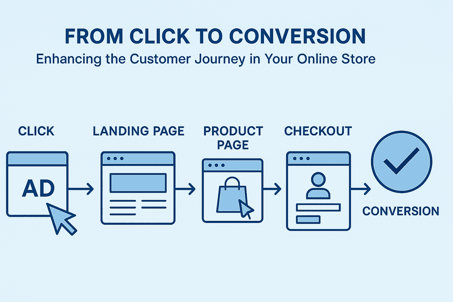
The Customer Journey: From First Click to Final Purchase
The customer journey in an online store typically spans several key stages. A potential buyer might first encounter your brand through an advertisement or search result (the initial click). They then land on your site (often on a landing page or homepage), browse products (e.g., product pages), add items to their cart, and hopefully complete the checkout process. Each of these touchpoints – Ad Click, Landing Page, Product Page, and Checkout – plays a pivotal role in the overall shopping experience. Let’s break down these stages and explore practical strategies to improve engagement and reduce drop-off at each one.
Ad Click: Making a Strong First Impression
The journey often begins before the customer even reaches your site – with an advertisement, social media post, or search result that they click on. This initial touchpoint is your chance to make a strong first impression and set the tone for what comes next.
- Match Ad Content with Landing Page: Ensure that your ad’s message aligns closely with the content on the landing page it leads to. If your ad promises "50% off winter jackets," the page it links to should prominently feature those winter jackets at 50% off. Consistency between the ad and landing page messaging confirms to visitors that they’re in the right place and encourages them to stay and explore.
- Target the Right Audience: A key part of improving conversion is getting the right people to click in the first place. Use targeting options (on advertising platforms or SEO keywords) to reach customers who are interested in what you offer. When your ads reach users who actually need or want your product, they’re more likely to engage further after clicking.
- Fast Load and Mobile-Friendly Experience: First impressions are also about speed and accessibility. Make sure the page that loads from the ad click is fast and mobile-friendly. Many users will be coming from mobile devices, and a slow or poorly formatted page can cause them to bounce within seconds. Optimizing for performance (like using optimized images and efficient code) ensures that you don’t lose the customer’s attention due to technical issues right after that initial click.
By paying attention to these details at the ad click stage, you pave the way for a smoother experience. The goal is to carry the momentum of that click forward – so the curiosity or interest that made someone click doesn’t fizzle out due to a disconnect or delay when they arrive on your site.
Landing Page: Capturing Interest Immediately
Once a visitor clicks through to your site, they often land on a landing page or homepage. This is where you need to grab their interest immediately and guide them towards exploring your products. At this stage, the customer is in the “browsing” or consideration mode, deciding if your store has what they want.
- Clear and Compelling Value Proposition: Within seconds of arriving, visitors should understand what your store offers and why it’s valuable to them. Use a clear headline or banner to highlight your value proposition – whether it’s unique products, great prices, free shipping, or some other benefit. For instance, a tagline like “Trendy Tech Gadgets – Free Shipping on Orders Over $50” quickly tells the customer what you sell (tech gadgets) and gives an incentive (free shipping).
- Relevant Content and Visuals: The content on your landing page should be relevant to whatever brought the visitor in. If they clicked an ad for winter jackets as in the earlier example, show them winter jacket deals or at least have a section for winter apparel on the page. Use high-quality visuals that resonate with your target audience – images of people enjoying your products can help users envision themselves with those items. Keep the design clean and focused; avoid overwhelming visitors with too many promotions or dense text. A few well-placed featured products or categories can invite users to delve deeper.
- Easy Navigation: Make sure it’s easy for newcomers to find what they might be looking for. A prominent search bar, clear menu categories, and obvious call-to-action buttons (like “Shop Now” or “View Collection”) can guide shoppers further into the site. If you have ongoing sales or popular categories, clearly direct users to those sections. The easier it is for someone to find relevant products, the more likely they’ll stick around instead of bouncing back to Google or clicking on a competitor.
- Trust Signals: Remember that at this stage, a visitor might be unfamiliar with your brand, so establishing trust quickly is important. Highlighting trust signals on the landing page can reassure new visitors. These could include things like customer testimonials (“Over 1,000 five-star reviews”), security badges (“Secure Checkout” or payment logos), or clear return policy highlights (“30-Day Money Back Guarantee”). Such signals help reduce skepticism and encourage the visitor to continue on the journey.
- Keep it Fast and Mobile-Optimized: Just as with the ad’s landing, your site’s main landing page must be fast-loading and look good on mobile devices. If your homepage or landing page is slow or doesn’t function well on a smartphone, expect the drop-off rate to soar. Use responsive design and test your pages on various devices to ensure a smooth experience for all users.
By capturing the visitor’s interest through clear messaging, attractive visuals, and user-friendly navigation on the landing page, you increase the chances that they’ll start exploring your store rather than leaving early.
Product Page: Showcasing Value and Building Trust
Once a shopper starts clicking on products that catch their eye, they enter the consideration phase of their journey on your site. The product page is where a casual visitor becomes a potential buyer. This is a critical touchpoint: it needs to convince the customer that the item is right for them and that buying from you will be worthwhile. A well-optimized product page should provide all the information and reassurance a customer needs to make a decision. Here are key elements and strategies to enhance engagement and reduce drop-offs on product pages:
- High-Quality Images (and maybe Videos): Online shoppers can’t physically touch or examine your product, so the visuals do the heavy lifting. Provide multiple high-resolution images showing the product from different angles, and in use if applicable. If possible, include a short video or 360° view. Visual clarity helps customers imagine owning the product, increasing their confidence in its quality.
- Detailed, Benefit-Focused Descriptions: A product description should be more than just a technical rundown – it’s your sales pitch for that item. Clearly explain what the product is, its features, and, most importantly, its benefits. How does it solve a problem or improve the customer’s life? Use a friendly, yet professional tone that matches your brand. Break up the text with bullet points for key features or specs so that it’s easy to scan. For example, if you’re selling a smartphone, list the key specs (battery life, camera quality) in bullets, but also include a brief narrative paragraph about how those specs translate into a better user experience (e.g., “Capture memories in stunning detail with a 108MP camera – even in low light.”).
- Include Social Proof: Shoppers often look for reassurance from their peers. Integrating customer reviews and ratings on the product page can significantly boost trust. A product that shows a strong average rating and has a number of positive reviews can persuade someone on the fence. Even critical reviews can be valuable if you respond or show how you addressed issues, demonstrating transparency. If your product is new and doesn’t have reviews yet, consider adding testimonials from your store in general or specific endorsements (“As seen on…”) if available.
- Clear Pricing and Stock Info: Be upfront about the price and any additional costs. If the product is on sale or there’s a special offer, make it highly visible. Clearly indicate if only a few items are left in stock (“Only 3 left – almost gone!”) to introduce a gentle sense of urgency, though this should be used honestly and sparingly. Also, if the price is high, highlight financing options or installment payments if you offer them.
- Prominent Call-to-Action: The “Add to Cart” or “Buy Now” button should be clearly visible and stand out on the page (e.g., contrasting color). Don’t make users hunt for how to actually purchase the item. The text on the button should be action-oriented (“Add to Cart” is standard, but some sites use “Buy Now” for an immediate purchase).
- Additional Details and Assistance: Think about any questions a customer might have and make the answers readily available on the product page. This could include size charts for clothing, dimensions for furniture, ingredients for food or cosmetics, etc. If there are common questions, provide an FAQ section on the page. Complex or technical products might benefit from a PDF manual or spec sheet link. The idea is to prevent the user from needing to leave the page to seek information elsewhere.
- Personalized Recommendations: Product pages are also a great place to keep shoppers engaged with your site. Consider showing related products or “Customers also bought” suggestions. For instance, on a fashion site, a product page for a jacket might show matching pants or accessories; on an electronics site, the page for a camera could suggest lenses or tripods. These personalized recommendations can increase the likelihood of a larger basket size or help the customer find a product that suits them better if the current one isn’t an exact fit. (Just be careful to present these as helpful options rather than distractions – you don’t want to overwhelm the user with too many choices that lead them away from making any purchase.)
- Trust and Convenience Factors: Remind customers of things like your return policy, warranty, or customer support. A simple line like “Free 30-day returns” or icons for “Free Shipping” and “Secure Checkout” near the Add to Cart button can alleviate fears. If you offer live chat support, having a chat widget available can let customers ask quick questions that might be holding them back from adding to cart.
By fully optimizing product pages with rich information, social proof, and a user-friendly layout, you help the customer feel confident and informed. The more confident a shopper is that the product meets their needs and that your store is trustworthy, the more likely they are to proceed to the next step: adding to cart and going to checkout.
Checkout: Streamlining the Final Step
The checkout process is the final gauntlet of the online shopping journey – and it’s where too many potential conversions are lost. At this stage, the customer has decided “I want this item” enough to add it to their cart. Your job now is to make completing the purchase as easy and reassuring as possible. A streamlined checkout can significantly reduce cart abandonment and boost your conversion rate. Consider the following strategies to optimize the checkout experience:
- Simplify the Process: Every extra step or form field in checkout is an opportunity for the customer to reconsider. Only ask for information that is truly needed to complete the purchase. If possible, allow users to check out with minimal required fields (name, shipping info, payment details). For instance, do you really need a phone number or title? If not, leave it out. You can also break the process into a few short, clear steps (e.g., Shipping -> Payment -> Review) with a progress indicator, so customers know it won’t drag on forever.
- Guest Checkout Option: Forcing new customers to create an account before buying is a common conversion killer. Offer a guest checkout option that doesn’t require registration. You can always invite them to create an account after the purchase is done (for example, on the thank-you page or via email, perhaps highlighting benefits like “track your orders easily by creating an account”). The key is not to put any roadblocks in front of completing that sale.
- Multiple Payment Methods: Customers have varying preferences for payment. Some may want to use a credit card; others might prefer PayPal, Apple Pay, Google Pay, or even buy-now-pay-later services. By offering a range of trusted payment options, you accommodate more customers and increase the chance that each finds their preferred way to pay. Also, clearly display security badges or a “Secure Checkout” message. When customers see that their payment info will be safe (e.g., SSL secure icons or credit card logos), it builds confidence to finalize the purchase.
- Transparent Shipping and Costs: One of the top reasons for cart abandonment is discovering unexpected costs at checkout (such as high shipping fees). To avoid this, be upfront about any additional costs early in the process. Ideally, by the time the customer is at the payment step, they should already know the total including shipping and tax. Provide shipping options (standard, expedited) with clear prices and delivery estimates. Surprises at the last click are unwelcome – transparency will reduce the chance the user bails out due to cost.
- Review Order Details: Give customers a clear summary of their order before final confirmation. This includes product names, quantities, selected options (size, color), prices, shipping method, and the final total. When people can easily double-check that everything is correct, they feel more comfortable proceeding. Include product thumbnails if possible, as visual confirmation can be helpful.
- Minimize Distractions: Once a user is in checkout, the focus should be on completing the purchase. This might mean designing your checkout pages with minimal navigation or extraneous links. Some stores even remove the standard site header and footer in checkout to keep the customer focused. You likely don’t want them clicking back to browse more (risking they abandon the cart), so keep the checkout interface clean and dedicated to the task at hand.
- Save Cart & Reminders: Not every checkout will be completed in one go – life happens, tabs get closed, or people reconsider. Make sure that if the customer leaves, their cart is saved (at least for a reasonable time). That way, when they return, they don’t have to start over. Additionally, consider implementing an abandoned cart recovery strategy: for example, sending a polite email reminder to customers who left items in their cart, possibly with an incentive like a small discount or free shipping. While this technically goes beyond the on-site checkout experience, it’s a powerful tool to convert those who almost purchased.
- Fast and Error-Free: Lastly, ensure the checkout process is technically smooth. Pages should load quickly, and forms should work correctly. Provide clear error messages if something is wrong (like a missing field or an invalid credit card number) so the user can easily fix it. Test the checkout on various devices and browsers. A frustrating glitch at the finish line can undo all the effort that got the customer there.
By streamlining checkout and removing friction, you significantly increase the likelihood that a customer will complete their purchase once they’ve started the process. Think of checkout as the final bridge – it needs to be short, sturdy, and easy to cross.
Tools and Techniques for Continuous Improvement
Enhancing the customer journey isn’t a one-and-done task. It requires continuous improvement, and the best way to improve is to use data and feedback. Here are some tools and techniques that can help you refine each stage of the journey:
- A/B Testing: Also known as split testing, A/B testing is a method to compare two versions of a webpage or element to see which one performs better. For example, you might test two versions of your landing page – one with a big hero image vs. one with a simple header – to see which keeps visitors engaged longer or leads to more product clicks. Similarly, you could A/B test different checkout layouts or button colors/text on product pages. By running these experiments, you rely on real user behavior to guide design decisions, rather than guesswork.
- Heatmaps and Session Recordings: Tools like heatmaps show you where users click, scroll, or spend time on a page. This visual data can uncover surprising insights, such as parts of a page that are being ignored or an element that people think is clickable but isn’t. Session recording tools let you replay individual user sessions to see exactly how a user navigated your site. By reviewing these, you might discover, for instance, that many users hover their mouse around looking for product sizing info (meaning you should make it more prominent), or that they repeatedly click a non-interactive element (indicating confusion in the UI).
- Analytics Funnel Tracking: Most web analytics platforms (like Google Analytics) allow you to set up a conversion funnel – a series of steps (e.g., landing page -> product page -> cart -> checkout -> purchase) – and then see where the biggest drop-offs occur. By analyzing your funnel, you can identify which stage is hurting the most. If you see a huge drop-off from cart to initiated checkout, you know to focus efforts on checkout optimization. If the drop-off is earlier (say, lots of people view products but don’t add to cart), you might investigate product page content or pricing.
- Customer Feedback: Don’t forget to listen to the voice of the customer directly. Consider implementing optional post-purchase surveys (“What could we improve on our site?”) or even an exit-intent survey for those who didn’t purchase (“What stopped you from completing your purchase today?” with multiple-choice options). Qualitative feedback can pinpoint issues that data alone might not reveal – maybe users felt the product photos were insufficient or were frustrated by lack of a particular payment option.
- Personalization Tools: Beyond just product recommendations, broader personalization tools can dynamically change content based on user behavior. For example, showing returning visitors items related to their last viewed products, or greeting them by name if they’re a logged-in customer. Personalization, when done tactfully, can make the shopping experience feel more tailored and engaging, which can improve conversion. Just be sure not to cross into the territory of feeling intrusive or creepy – the goal is a welcome personal touch, not a sense of being tracked.
By leveraging these tools and techniques, you create a cycle of continuous optimization. You make changes, measure the impact, learn from data, and then fine-tune further. Over time, this iterative process can lead to significant improvements in your conversion rates and overall customer satisfaction.
Conclusion: Embrace Customer-Centric Design for Ongoing Success
In the fast-paced and competitive world of online commerce, success comes from never settling. From the moment a customer clicks an ad to the moment they confirm a purchase, every step should be crafted with the customer’s perspective in mind. By enhancing each stage of the customer journey – ensuring ads and landing pages align with customer expectations, product pages inform and inspire, and checkouts are swift and hassle-free – you create an experience that puts the customer first.
Remember that optimization is an ongoing journey in itself. Regularly review how users interact with your store, gather feedback, and stay updated with new e-commerce trends and technologies. Even small tweaks, like simplifying a form or rewriting a headline, can have a big impact when they remove friction or address a customer need.
Finally, a customer-centric approach doesn’t just yield a one-time sale; it lays the groundwork for repeat business and word-of-mouth referrals. When customers feel that every interaction – from click to conversion – has been smooth and positive, they’re more likely to come back and to sing your store’s praises to others. In essence, by continuously optimizing the journey with the customer’s satisfaction as the priority, you’re not only boosting conversions today but also building a loyal customer base for the future.