


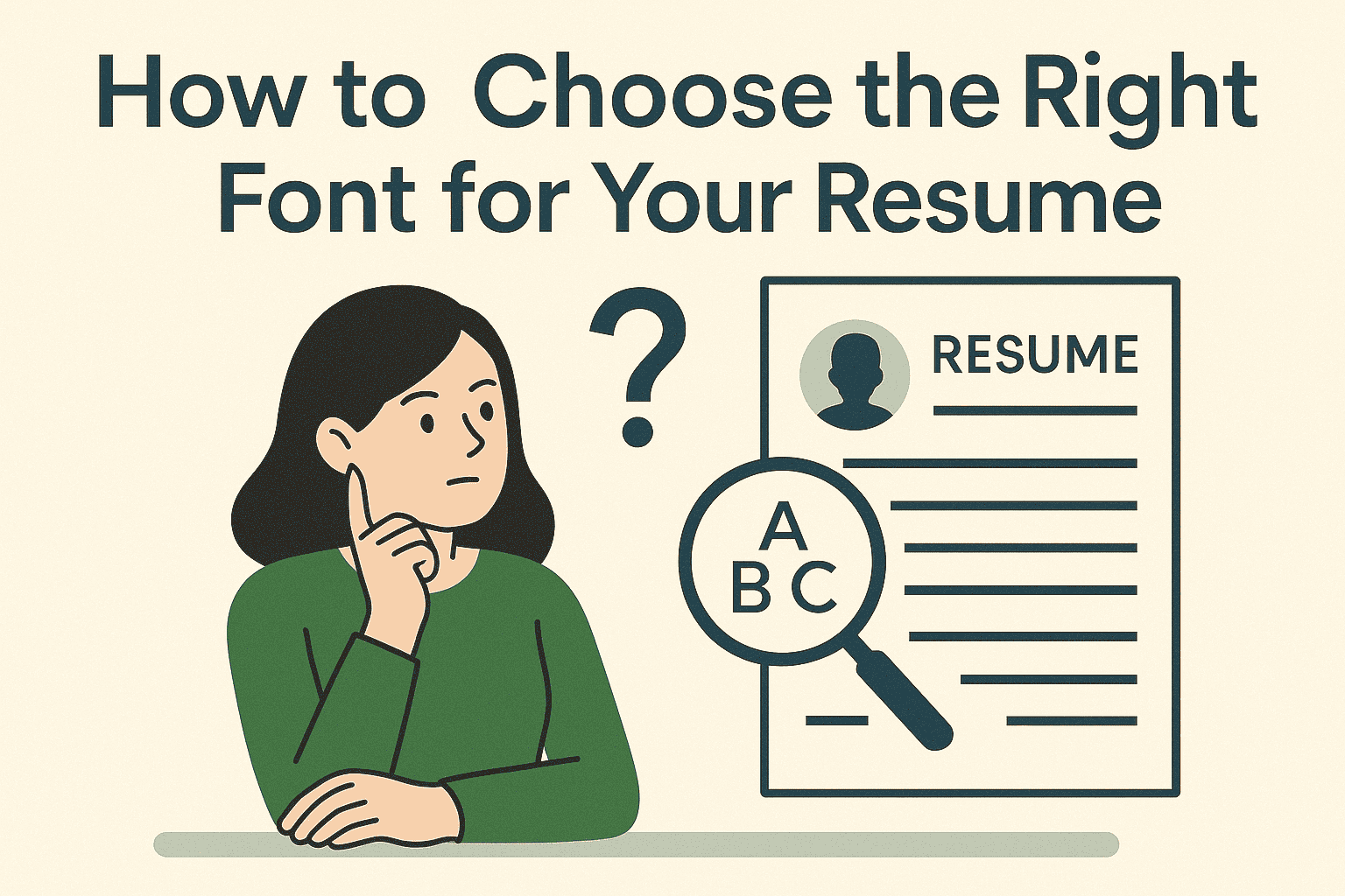
How to Choose the Right Font for Your Resume
The best resume fonts are simple and clean. Sans-serif fonts like Calibri, Arial, and Helvetica work best. Use 10-12 point size for your main text. Keep everything consistent and easy to read. Avoid fancy fonts that look unprofessional or confuse computer systems.
The Critical Importance of Resume Font Selection
Your resume gets just six seconds to make a first impression. Your font choice can make or break that moment. The right font makes you look professional and helps you get noticed. The wrong font sends your resume straight to the trash.
Choosing fonts is harder than ever. Computer systems scan resumes before humans see them. These systems can reject good candidates for using bad fonts. You need fonts that work for both computers and people.
Why Your Font Choice Really Matters
Understanding the psychology behind resume fonts helps you make smarter choices. Professional resume typography affects how recruiters perceive your attention to detail. The best resume fonts create positive first impressions that support your candidacy.
How Fonts Affect First Impressions
Hiring managers judge you before reading your experience. Your font sends a message about who you are. Clean fonts suggest you pay attention to details. Messy fonts make you look careless.
Your brain processes what it sees faster than what it reads. A bad font makes your resume harder to scan. A good font lets your skills shine through clearly.
What Hiring Managers Think About Fonts
Good fonts make hiring managers happy to read your resume. Bad fonts annoy them and waste their time. They might stop reading before seeing your best qualifications.
Professional fonts show you understand business standards. Creative fonts work in some jobs but not others. Pick fonts that match your industry expectations.
How Computer Systems Read Your Resume
Modern applicant tracking systems demand ATS friendly fonts for accurate parsing. Resume fonts that work well with these systems increase your chances significantly. Understanding these technical requirements helps you avoid costly formatting mistakes.
Understanding Resume Scanning Software
Most companies use computer programs to read resumes first. These programs look for keywords and qualifications. They rank candidates before humans get involved.
The software needs to read your font correctly. Some fonts confuse these programs completely. Others work perfectly every time.
What Makes Fonts Computer-Friendly
Good resume fonts have clear, simple letters. Each letter looks different from others. The spacing between letters stays consistent throughout.
Avoid fonts with fancy decorations or unusual shapes. Stick to standard fonts that every computer recognizes. This keeps your information accurate when scanned.
Problems That Kill Your Chances
Decorative fonts often get misread by computers. Your name might become gibberish in the system. Your phone number could turn into random symbols.
Some programs skip resumes they cannot read properly. You lose opportunities before anyone sees your qualifications. Pick safe fonts to avoid these problems.
The Best Resume Fonts
Selecting from the best resume fonts available ensures professional presentation. Resume fonts like Calibri, Arial, and Helvetica dominate successful applications. These proven choices balance readability, compatibility, and professional appearance perfectly.
Top Sans-Serif Font Choices
Sans-serif means fonts without little lines on letters. These fonts look modern and professional. They work great on computer screens and printed pages.
Most successful resumes use sans-serif fonts. They look clean and easy to read. Hiring managers prefer them over older font styles.
Calibri - The Modern Professional Choice
The Calibri resume font has become the gold standard for modern applications. This font comes with Microsoft Word on every computer system. It looks friendly but maintains complete professional credibility throughout your document.
This font uses space efficiently on your resume. You can fit more information without looking crowded. Many Fortune 500 companies use Calibri internally.
Arial - The Safe Universal Option
The Arial resume font works perfectly on every computer and phone. It prints clearly and displays flawlessly in all digital formats. You never have to worry about compatibility issues with this reliable choice.
The letters in Arial are perfectly balanced. They look the same size throughout your resume. This consistency makes your document look polished and professional.
Helvetica - The Designer's Favorite
Helvetica is considered the perfect font by many designers. It looks incredibly clean and sophisticated. Mac computers come with Helvetica built-in.
Creative industries love seeing Helvetica on resumes. It shows you understand good design principles. The font works especially well for marketing and advertising jobs.
When to Use Traditional Serif Fonts
Traditional serif fonts still serve important roles in professional resume typography. These fonts work best for conservative industries that value established traditions. Understanding when serif fonts enhance your application helps you make strategic choices.
Understanding Serif Font Benefits
Serif fonts have small lines attached to letters. They look more traditional and formal. Some industries still prefer these classic styles.
Law firms, banks, and government offices often expect serif fonts. These fonts suggest stability and established traditions. They work well for conservative career fields.
Times New Roman - The Conservative Standard
Times New Roman packs a lot of text into small spaces. It works great when you have extensive experience to list. The font looks serious and authoritative.
Academic institutions and legal organizations prefer Times New Roman. It suggests thoroughness and attention to scholarly details. Use it for traditional professional roles.
Georgia - The Screen-Friendly Serif
Georgia was designed specifically for computer screens. It combines traditional serif style with modern readability. The letters stay clear at any size.
This font works well for both digital and printed resumes. It bridges the gap between old and new styles. Consider Georgia for versatile professional applications.
Getting Your Font Size Right
Proper resume font size creates the perfect balance between readability and space efficiency. Professional resume typography requires careful attention to sizing hierarchies throughout your document. Understanding these principles helps you optimize your resume's visual impact and scanning efficiency.
Choosing the Perfect Text Size
Your main text should be 10-12 points in size. Smaller text becomes hard to read quickly. Larger text makes your resume look empty and unprofessional.
11-point text usually works best for most resumes. It balances readability with efficient space usage. Test different sizes to see what looks right.
Creating Clear Section Headers
Your name should be the largest text on your resume. Use 16-20 points to make it stand out clearly. Section headers work well at 14-16 points.
Make sure each level of text has a different size. This creates a clear hierarchy for readers. They can scan your resume more efficiently this way.
Matching Fonts to Your Industry
Different industries have specific expectations for professional resume typography and presentation. Understanding these cultural preferences helps you select appropriate resume fonts for your field. Strategic font selection demonstrates industry awareness and cultural fit to potential employers.
Creative Fields and Font Flexibility
Design, advertising, and media companies appreciate font creativity. You can use more interesting fonts like Futura or Montserrat. Still keep everything professional and readable.
Show your design sense through subtle font choices. Avoid going overboard with unusual options. Your skills should impress them, not shock them.
Conservative Industries and Safe Choices
Banking, law, healthcare, and government prefer traditional fonts. Stick with Times New Roman, Arial, or Calibri. These industries value reliability over creativity.
Your font choice shows you understand their culture. Conservative fonts suggest you follow rules and pay attention. This matters in regulated industries.
Technology Companies and Modern Preferences
Tech companies like clean, modern fonts that suggest innovation. Sans-serif fonts work perfectly for these applications. Consider Source Sans Pro or Open Sans.
Avoid fonts that look outdated or overly formal. Tech culture values efficiency and forward-thinking approaches. Your font should reflect these values clearly.
Font Mistakes That Ruin Your Chances
Common font errors destroy otherwise excellent resumes and cost valuable opportunities. Understanding these mistakes helps you avoid costly formatting disasters in your applications. Professional resume typography requires attention to detail and consistency throughout your document.
Never Mix Different Font Families
Use only one font family throughout your entire resume. Mixing fonts creates visual chaos and looks unprofessional. Stick to your chosen font consistently.
You can vary the size and boldness of your font. This creates visual interest without looking messy. Consistency shows attention to professional details.
Keep Font Sizes Consistent
All your job descriptions should use the same font size. All your section headers should match each other. Inconsistency suggests poor attention to detail.
Create a simple system and follow it throughout. This makes your resume look polished and professional. Hiring managers notice these details immediately.
Avoid Fancy Decorative Fonts
Script fonts, decorative typefaces, and novelty fonts look unprofessional. They're hard to read and confuse computer systems. Save them for party invitations.
Your resume needs to communicate clearly and quickly. Fancy fonts get in the way of your message. Stick to simple, readable options that work.
Tips for Perfect Resume Formatting
Effective resume formatting tips transform good content into exceptional presentations that capture attention. Professional resume typography extends beyond font choice to include spacing, alignment, and hierarchy decisions. These formatting principles work together to create polished documents that stand out positively.
Creating Clean, Readable Layouts
Use 1.15 to 1.5 line spacing for easy reading
Leave white space around sections to avoid crowding
Align everything consistently throughout your document
Keep margins between 0.5 and 1 inch on all sides
Use the same formatting style for similar elements
Using Bold and Italic Text Effectively
Bold your section headers like "Work Experience" and "Education"
Bold company names to make them stand out clearly
Use italics for job titles or publication names only
Never use both bold and italic on the same text
Limit formatting to maintain clean, professional appearance
Testing Your Font Before Applying
Testing ensures your chosen resume fonts perform perfectly across all platforms and situations. This validation process protects you from technical failures that could eliminate your candidacy. Professional preparation includes checking compatibility, readability, and print quality before submitting applications.
Checking How Your Resume Looks Everywhere
View your resume on different computers and phones. Make sure it looks the same everywhere. What works on your computer might break elsewhere.
Test your resume with different software programs. Check how it looks in Microsoft Word, Google Docs, and Adobe Reader. Consistency across platforms matters greatly.
Making Sure Your Resume Prints Well
Many interviews still involve printed copies of resumes. Print your resume to check how it looks. Make sure the font stays clear and professional.
Test printing at different sizes and on different printers. Your font should remain readable in all situations. This preparation shows professional thoroughness.
Future Trends in Resume Fonts
Staying current with resume font trends helps you maintain modern, relevant applications. The best resume fonts continue evolving as technology and design preferences change. Understanding these developments keeps your professional presentation fresh and contemporary.
New Fonts Gaining Popularity
Modern fonts like Inter, Roboto, and System UI are becoming popular. They offer fresh alternatives to traditional choices. These fonts work well across all devices.
Stay current but not trendy with your font choices. Pick fonts that will look professional for months. Avoid fonts that might seem outdated quickly.
Technology Changes Affecting Font Choices
New font technologies allow more customization without compatibility problems. Variable fonts can adjust their weight and width automatically. These advances may change resume design soon.
Focus on current best practices while staying aware of changes. The fundamentals of good typography remain the same. Clarity and professionalism always matter most.
Making Your Final Font Decision
Strategic font selection requires careful consideration of multiple factors affecting your career success. The best resume fonts align with your industry, experience level, and target company culture. Smart choices in professional resume typography demonstrate understanding of business communication standards.
Choosing Based on Your Situation
Consider your career level when picking fonts. Entry-level candidates should choose conservative options. Senior executives can use more distinctive choices confidently.
Think about your target companies and their cultures. Research their websites and materials for font clues. Match their style preferences when possible.
Keeping Everything Consistent
Use the same font across all your job search materials. Your resume, cover letter, and LinkedIn profile should match. This consistency strengthens your personal brand.
Consistency shows attention to detail that employers value highly. It demonstrates you understand professional presentation standards. This small detail can set you apart.
Conclusion
The right resume font works like a silent partner in your job search. It makes your qualifications easy to read and professionally presented. Good fonts help you get noticed for the right reasons.
Tough job market, every detail matters tremendously. Your font choice affects both computer systems and human readers. Smart font selection can be the difference between getting interviews and getting ignored.
Choose fonts that prioritize readability and professional appearance over personal preferences. Test your choice across different platforms and printing situations. Make sure everything works perfectly before sending applications.
Remember that the best resume font becomes invisible to readers. It lets your experience and skills take center stage. Your achievements should grab attention, not your typography choices.
Take time to make this decision thoughtfully and strategically. The right font supports your professional story with clear, accessible presentation. This attention to detail shows employers you understand professional standards and care about quality work.